

Changing WordPress Theme: BookerTalk Gets A Makeover

The secret of change is to focus all of your energy not on fighting the old but on building the new.
Socrates
After two months of hesitation and prevarication, I bit the bullet last week and changed my blog theme. If only I’d listened to old Socrates I would have done this earlier, saving myself a heap of frustration.
The problem was that I really liked the Mystique theme I’d been using for the last eight years. But there were two things that really bugged me.
One was that I could not get my tagline to be legible in the header. No matter what I did, the words “Adventures with great fiction around the world” were never legible against the background image. Helpful people on the WordPress forum gave some suggestions on how to fix this but it involved something called CSS customisation and frankly, that went over my head. So I just gave up.

The second problem only became apparent once I started working with the new Gutenberg block editor. Having mastered the basics I wanted to branch out and experiment with some of the more advanced design functions. Though I suspected they would ultimately prove to be more ‘style over substance’ I was still curious about blocks called “patterns” and “tiled gallery”.
But every attempt resulted in the same error message: my theme was not compatible with Gutenberg.
I could have just thrown in the towel there and then. Accepted that Mystique wasn’t perfect but, just like my favourite pair of boots, it was comfortable.
But there was one thought that just wouldn’t go away: Gutenberg, for all its current flaws, is the future. It’s where WordPress is putting all its efforts. Programmers likewise are only interested in developing themes, widgets and plug ins that are compatible with Gutenberg. So anything that isn’t compatible (like my theme!) will get slowly get more creaky and unresponsive.
I decided to make the change now rather than hang on until the bitter end.
Making the switch
Changing the the theme wasn’t nearly as horrible an experience as I expected. The biggest issue was finding a theme that matched my most important requirements:
- Easy to use
- A home page design that displays text, not just images
- A menu bar that appears below (not above) the main image
- A navigation bar appearing on the right of the screen
I thought these were fairly basic needs and there would be many design options available. But I was wrong. WordPress seems to have become more like a website design platform than a text-based blog. So many of the themes are geared towards the needs of businesses or lifestyle bloggers. If you want a blog with high visual appeal (think large images and minimal text) you’re in luck. Photographers, travel bloggers, fitness bloggers are well served. But if you want a blog with more emphasis on substantive content, the choices are limited.
I eventually plumped for a theme called ColorMag which is described as “suitable for news, newspaper, magazine, publishing” sites. At first glance, it looked too image-heavy for my needs but I discovered you can change the layout to replace images with text blocks.
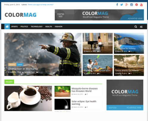
The new look BookerTalk, using the ColorMag theme, is now live. It’s still a work in progress. Though I’ve managed to customise the colours and get the menus working, I’m still trying to figure out how to get the home page to show more than one line from each post. And I’ll probably do some more tweaks to the main menu.
Tips For Changing Themes
I don’t claim to be an expert on WordPress themes but, based on my experience, I thought I’d offer some tips for those of you who may be thinking of changing themes.
- Before you make any changes, do some screen grabs of your existing site. Pay particular attention to capturing your current menu and navigation bars. I assumed when I switched themes, that my menu and navigation items would simply transfer across. I was wrong. I had to re-create them. Luckily I had my screen grabs so I didn’t need to rely on my memory for what items went where.
- Also before you lost your current theme, be sure to take note of any custom colours you’ve used. Look at my earlier post on text formatting to learn how to discover your colour specification. It would probably be wise also to make a note of any copy you use regularly (like explanations of memes you might do each week).
- To discover available themes go to My Sites »Themes. This path will take you to a new screen with “recommended themes”, based on your WordPress plan. I found this easier than using the path of WPAdmin »Appearance»Themes»Add New. You’ll get many more themes to select from in this second method but there is almost too much choice and you can easily get lost.
- When you find a theme you think will be suitable, click the image – that should give you a page describing the theme in more detail. You’ll be able to see how much customisation is possible. Pay particular attention to the “features” and “specs” sections which should tell you, for example, if threaded comments are supported; if you can add a site logo and whether featured images are possible. Make sure that your new theme allows for widgets.
- Don’t apply your chosen site until you click on the “live demo” option. You need to get a preview of how your content will look in this theme.
- Try out a few themes before you make your final selection.
- Once you select “activate this design” your new theme will be applied. All is not lost however if, having pressed that button, you change your mind. You can easily start all over again. Any themes that you have “activated” will be shown by going to WPAdmin »Appearance»Themes»
Can You Help?
I’d love to hear what you think of the new design. Did I miss something when I made the switch over? Are there any features that are not working the way you think they should? Any improvements you’d like to see? Do leave me a comment to let me know…
The logo is too big and takes up space. I’ve seen the demo site of ColorMag and the worded logo size is 265×90. Other demos use different sizes too and the biggest size so far is 321×95. I think it’s better if you change the logo alignment to the center so the white space is balance.
As for the menu, I’m not sure why there are 2 home menus there. You can either remove the home icon or the other. Since you already have the search function on the sidebar I think you can remove the one on the menu just to save some space. You could also group some of the menus as a dropdown so it’s all one-line. Just my two cents 🙂
Thanks so much for taking the time to give me this feedback. Unfortunately I can’t seem to change the alignment of the logo to occupy the centre spot; the template doesn’t allow this.
I hadn’t noticed that there were two home buttons – but have now fixed this and will also give some more thought to grouping the menus
I think it looks nice but the most important thing is whether or not you like it. 🙂
I’m getting used to it
I like it, Karen: it looks clean, fresh and bold. 😃
Thanks Jessica. Sorry for the slow response to your comment – it went into the spam filter for some strange reason
That’s okay! I get that happen to some of my regularly commenters now and again, too.
I like clean and simple themes. I really don’t like light text on a dark background so thank you for not subjecting us to that!
My initial reaction was “Why?” for the doubling of the title — in the small logo and text. I would find it more visually pleasing to leave out the logo, or perhaps make it a bit bigger so you can see what it says, and leave out the text-only version. But maybe you had a reason to include both?
The logo is one of the things I’m not happy about Lory. The theme doesn’t give any info about the size of the image allowed as a logo so it needs a re-design to make it more readable. The next version will also be simpler.
I really like your new theme. I changed mine circa two years ago – it was a little challenging, but so satisfying once I’d moved over.
As for the block editor, I’m slowly adapting – I do miss some of the functionality of the classic editor, but also wonder if it’s just that I’ve not found out how to do what I want in the new editor yet. I’m learning slowly, but certainly don’t hate it as much as I did initially.
What are you trying to do that you haven’t found a way to do in block editor yet Jo? Maybe I can help
Mostly small things. I liked being able to use a bulleted list in a table (for my books reviewed page) and to be able to split a numbered list e.g. with an image in between, but to have the numbering continue.
I also liked having access to the HTML editor, although I’ve just doscoved that there is a HTML block, so can’t complain on that score.
The more I’ve used the new editor, the more I’ve come to like it, but I don’t find it as intuitive as the classic editor. Likely just a case of needing to get used to it though.
The good news is that you CAN do a split list with the image in between. Create the first part of your list, starting say with number one and going to number 10. Then create a new block for your image. After that insert a new list block. Then look on the toolbar to the right of your screen, scroll down and you should see a field called “ordered list settings”. That gives you the ability to start that second list with whatever number you want (in this example it would be number 6). Every number after that will follow in sequence, 7, 8, etc.
Fantastic – thank you! 🙂
I like the new bold, clean appearance. I’m slowly coming to terms with the new block editor. Changing my theme? not for the moment. But I’ll bookmark your helpful post.
The more yiu use the block editor the easier it gets Alison.
I agree with everyone else. Good choice.
Thanks for the reassurance about my choice Frank.
Glad you found a theme you like – it’s certainly bright! I’ve considered changing mine, but I *am* comfortable with it at the moment, so maybe later…
I sympathise so much because I was attached to my theme too. It felt a wrench to let it go.
This is clear and easy to navigate and I like the overall look. Thank you for the helpful advice and tips, although I’ve been using the new block editor and have tried a few tweaks I do really need to update mine and this has given me the push I needed.
it makes good sense to get fully comfortable with block editor first. Yiu can still spend some time to investigate possible themes and save them for when yiu are ready.
Looks great! White backgrounds always work best for me and the bold blue is a vibrant contrast, giving it a jolt of energy. I’m also very fond of widgets down the side. Good choice!
So many of the themes have the widgets at the bottom of the page which makes no sense to me. As a reader I simply wouldn’t scroll that far down.
Your new look is nice, but somehow the old theme was more “you”. Hard to explain it 🙂
Interesting reaction!
I am glad you found something you like. I’m super picky, and this wouldn’t work for me. I feel it aggressive, too big pictures and headers, plus when you look at some back pages, it displays 2 posts, but nit ending them at the same level, so one preview is longer than the other next to it.
It took me years to find a theme I liked, and I couldn’t find any, that’s why I did what I have on my homepage. I followed what some bookstores are doing. And I did it only with basic html, and free themes
Thanks for alerting me to the issue of how the posts are displayed. I’ve now discovered it makes a difference if one post has a featured image and the other doesn’t
I’m so glad you bit the bullet, it was definitely the right choice! I’ve toyed with the idea occasionally of changing my blog’s theme, to something more Professional(TM), but I always come back around to the “if it ain’t broke” philosophy. I’m bookmarking this post for when “someday” comes! 😉
I wouldn’t have changed either except that mine was “broke”
Great makeover! Enjoy!
Your layout is clean and beautiful.
I love my theme but I have known for a few years now that I was going to have make a change. Maybe sooner is better but . . . I’ve never seen anything I liked half as well. 🙁
Thanks for giving the benefit of your experience. It helps me get closer to being brave myself.
Oh, my word – I just got brave and went looking and my theme has been updated! I never would have even looked without your encouragement, Karen. Thanks again.
That’s great to hear. Are the upgrades going to be of practical help for you Debbie or are they more to support e commerce.
I love the new layout! And I think you’ll be glad you made the switch to the block editor. I made that change early on. Although it took me a while to get acquainted with the new process, once I did I could see how much better it is than the classic editor. And later changes have improved it even more. I especially like the reusable block feature. I have, for example, a couple of challenges that I routinely participate in. Instead of having to position the challenge’s graphic and required text, with links, each time, I now just insert the reusable block I created and saved. Thanks for sharing your experiences with the “business end” of presentation.
I tried block editor when it was first introduced and hated it. But second time around it all fell into place and now I’m a big fan.
Oh my goodness! I soooo very much need to do this but I’m very very afraid! Just what you’ve described here has me feeling anxiety…especially needing to recreate elements. I need you to sit with me!!! I admire your bravery!